Movies Need to Be More Colorful
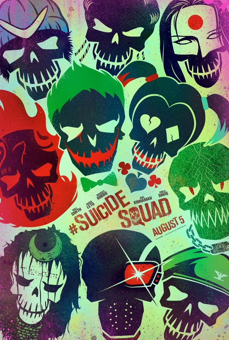
Editor’s Note: No, this isn’t about the lack of diversity in the Oscars race… but that’s an issue too. I’ll have more about that in a couple weeks. This past week, Warner Brothers made a splash with their updated advertising for the Justice League, Wonder Woman, and Suicide Squad. To be honest, I’m not a huge sucker for comic book movies- I’ll go see them if they seem good, but I’m not one to paw over every publicity still or argue over who played the best Joker.
James Whitbrook’s article at io9 contrasts the new Suicide Squad posters with the ones from Batman v. Superman.[ref]Which sounds like it should be a courtroom drama about a messy divorce- who should get custody of Robin?[/ref] It’s true- they look radically different. Colorful. Vibrant. Exciting. I’ve seen a million brooding Batman images. Ho hum.
 From what I’ve seen of the trailers, the film’s color scheme doesn’t really follow this pattern- Harley Quinn’s costume is slightly metallic and sparkly, but that’s it. I suspect the new posters were the product of a crack advertising team who came up with the idea after the movie had been shot- great work, guys!
I won’t be the first to point out the prevalence of teal and orange in our mainstream movies- they’re natural contrasts, people are basically orange any way, the sky are naturally blue. Just crank your saturation up a bit. This usually gets traced back to the advent of digital color grading and O Brother Where Art Thou, but people have been using chemicals to manipulate color film since it was invented.
Even before then, black and white silent films could be tinted[ref]Actually, tinting and toning are two different processes...[/ref]- this would apply a color cast to the whole scene, like shining a big light over everything. Scenes at night might be tinted blue[ref]We still do this when shooting day-for-night. Just make every thing look dark and navy colored.[/ref], daytime exteriors might be tinted yellow.
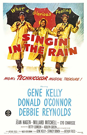
But people have strange associations with color images- black and white movies were still made regularly after color film had been invented. Yes, it was cheaper, but audiences regarded it as more realistic. Consider On The Waterfront, a gritty, salt-of-the-Earth  crime drama, from 1954, in black and white, and Singin’ in the Rain, a charming musical comedy about show business, from 1952, in bright, vibrant color.[ref]Singin’ in the Rain is about the transition from silent films to talkies, so shooting in color for the main narrative allows for contrast when showing black and white silent films.[/ref]
Still don’t believe me? The Wizard of Oz has boring, everyday Kansas in sepia, while Oz gets to be in Technicolor.[ref]Why Dorothy decides to go back is the subject of much speculation…[/ref]
Batman v. Superman is the continuation of this trend. Even though almost every movie we see is in color now, it’s toned down in “realistic” dramas, and boosted in comedies- but even then, the main palette is usually teal and orange.[ref]Suicide Squad is probably going for the zanier, anarchic side of the superhero movie spectrum.[/ref]
The main exception to this is in animation.[ref]Granted, animated movies tend to be comedic…[/ref] You’ll find more color in your average Pixar movie than most big budget blockbusters. Look at the main characters of Monsters, Inc.- Sully is blue with flecks of  purple, and Mike is a bright green eyeball. Ratatouille is slightly muted in its backgrounds, but that only enhances the vividness of the food, and the flashes of color we see when Remy describes how it tastes.
The movie whose color scheme I remember the most from the past year is actually Mad Max: Fury Road. Yes, it’s teal and orange to the extreme[ref]Behind the scenes photos have the sand a more ordinary pale yellow.[/ref], but it fits the world really well. And there are occasional times where a color will pop- like the War Boys covered in white paint, or the red and yellow flares Immortan Joe fires at the beginning. It would be better if we weren’t already oversaturated with the same palette.
To me, Mad Max actually looks kind of sepia toned- take out the color, and the film would work quite nicely in a dusty black and white. The issue, then is not just the fact that everyone uses the same color scheme, it’s that everything on screen gets shunted into one of the two dominant colors. You’re either a bright blue sky, or the same color as sand.
Where are the greens, yellows, pinks, and purples?[ref]Netflix's Jessica Jones has some great purple lighting cues when Killgrave appears.[/ref] The cyans, the mauves, the cobalts, the greenish-purples, and purplish-greens? Whatever happened to the infrareds and ultraviolets?[ref]Actually, for all I know, they're still there, assuming the cameras can detect them. Which they probably can't.[/ref]
We could stand to have not just a more diverse selection of palettes, but more diverse color within them as well.
